the tradesman
Created for a class project, this magazine gave me the opportunity to learn more about Adobe InDesign. Inside, I included several stories I wrote through the course of the semester.
- Software: Adobe InDesign
- Client: Auburn University
- Project Type: Magazine Design/Creation
about this project
In my public relations Style and Design class, we designed magazines from scratch, filling them with six stories we wrote over the course of the semester. Throughout the creation process, I learned more about Adobe InDesign and how to create and publish a magazine.
I wanted the design and title to communicate my message. Personally, I’m always looking to add a new skill to my repertoire, and I love the idea of a jack-of-all-trades, hence my less-than-subtle title, “The Tradesman.” In a world of slashed PR budgets and small, in-house marketing teams, I want to bring value through a set of diverse skills and abilities.
As for the magazine’s color scheme, I’ve employed a simple mix of black, white and gold. It’s a strong, classic pairing, and I like the consistency of it throughout the magazine. While I love my website’s muted shades of blue and brown, I wanted to experiment with a new style here, and I’m glad I did.
the process
Before starting the assignment, I knew very little about typography. I could tell when two fonts paired badly, and I knew never to use Comic Sans, but I didn’t know how to select and pair fonts. Throughout the process, I discovered many fonts I liked, and I learned more about pairing serif and sans-serif fonts.
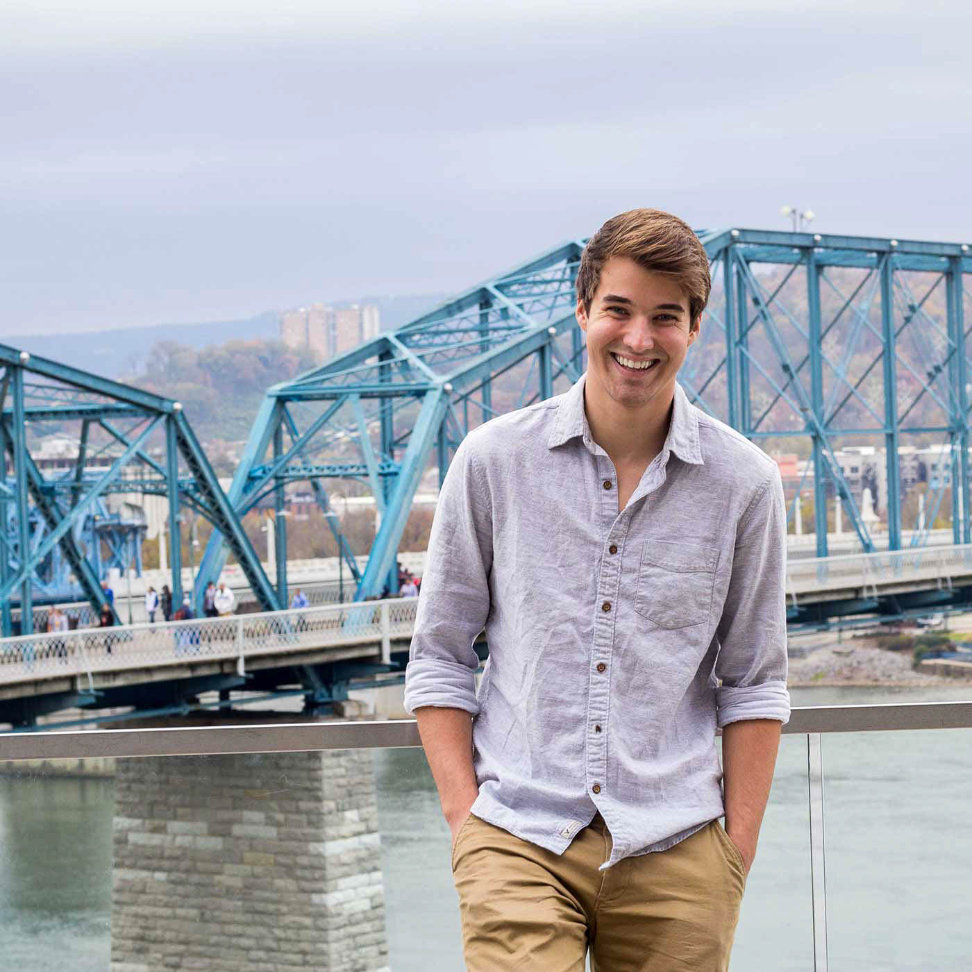
My favorite part of designing the magazine? Definitely the cover. I loved playing with different styles, experimenting with different fonts and titles until I found a match I loved. Using Photoshop, I cut myself out of the image, duplicated the layer, and placed the cutout on top of the magazine title, neatly setting the title behind my head. I love the way it draws the reader in just a bit more, and I think it’s a nice, slick touch.
Within the magazine, I’ve used Playfair Display (headlines and decorative), Bebas (magazine title), and Minion Pro (body text). I limited myself to two font-families per page, as using too many different ones is often distracting and messy.
This magazine design process was by far my favorite part of my final project. I loved seeing my photography and post-processing skills integrate with the text, creating a slick, elegant design. And best of all, I vastly expanded my knowledge and understanding of InDesign, and I now feel comfortable using the program for an array of designs.
Before starting the assignment, I knew very little about typography. I could tell when two fonts paired badly, and I knew never to use Comic Sans, but I didn’t know how to select and pair fonts. Throughout the process, I discovered many fonts I liked, and I learned more about pairing serif and sans-serif fonts.
My favorite part of designing the magazine? Definitely the cover. I loved playing with different styles, experimenting with different fonts and titles until I found a match I loved. Using Photoshop, I cut myself out of the image, duplicated the layer, and placed the cutout on top of the magazine title, neatly setting the title behind my head. I love the way it draws the reader in just a bit more, and I think it’s a nice, slick touch.
Within the magazine, I’ve used Playfair Display (headlines and decorative), Bebas (magazine title), and Minion Pro (body text). I limited myself to two font-families per page, as using too many different ones is often distracting and messy.
This magazine design process was by far my favorite part of my final project. I loved seeing my photography and post-processing skills integrate with the text, creating a slick, elegant design. And best of all, I vastly expanded my knowledge and understanding of InDesign, and I now feel comfortable using the program for an array of designs.
related projects


contact me
Jack is an amazing young man. He truly impressed me in class. Jack is dedicated and will work his hardest to complete any task. He is always willing to take on a challenge. He can lead, but he can also take direction. He understands constructive criticism and is able to take suggestions to make his work even stronger. Jack has knowledge and ability in public relations, but he is also skilled with photography and design. Jack is able to work with others or independently. He is also respectful of others.
I cannot speak highly enough about Jack Parrish. Jack exhibits an excellent desire and willingness to take on new assignments and responsibilities. He is dependable, conscientious and works collaboratively in an agency environment... He is one of the most talented young people I have ever had the pleasure of working with.